300,000+ users.
A platform that held them back.
Dell Financial Services needed a platform that could help enterprise IT teams track, manage, and retire hardware assets at scale. The existing tools were fragmented, inconsistent, and built around internal processes rather than the people using them.
My job was to rethink the experience from the ground up — bringing clarity, consistency, and confidence to a platform that touched hundreds of thousands of users globally.
"Enterprise software has a reputation for being painful to use. We set out to change that — one screen at a time."
Fragmented information architecture
Assets, contracts, invoices, and reports lived in disconnected silos. Users had to jump between sections to complete basic tasks.
Data overload without clarity
The dashboard surfaced everything at once — without hierarchy, priority, or context. Users couldn't quickly understand what needed their attention.
Designing for scale
With 300,000+ users across different roles and regions, the design had to work for power users and occasional visitors alike.
Stakeholder alignment across functions
Product, engineering, finance, and business teams all had different definitions of success. Keeping everyone aligned required constant facilitation.
Understanding the
real workflow
We ran discovery sessions with IT managers, finance teams, and operations leads across multiple regions. The goal wasn't just to understand what they did — but to understand where the friction was, and why it had been tolerated for so long.
A dashboard that
earns attention
The redesigned dashboard leads with what matters — active assets, upcoming contract expirations, open invoices, and support requests — all in one view. Data visualization replaced raw numbers, and a customizable layout let users tailor the experience to their role.
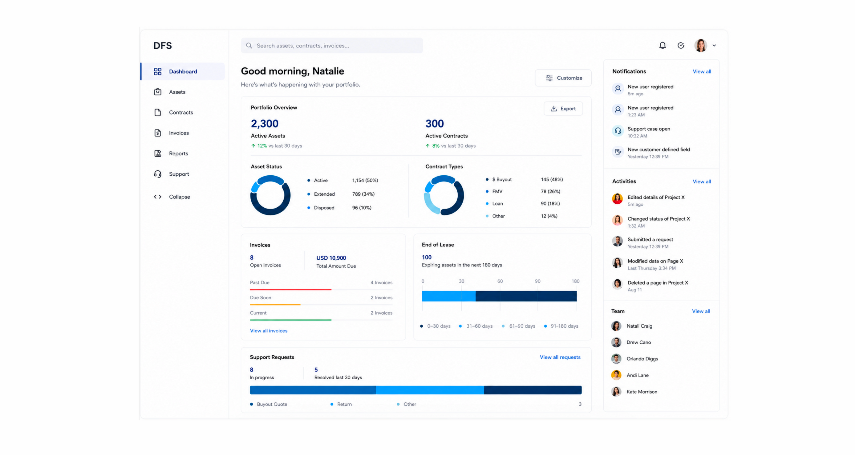
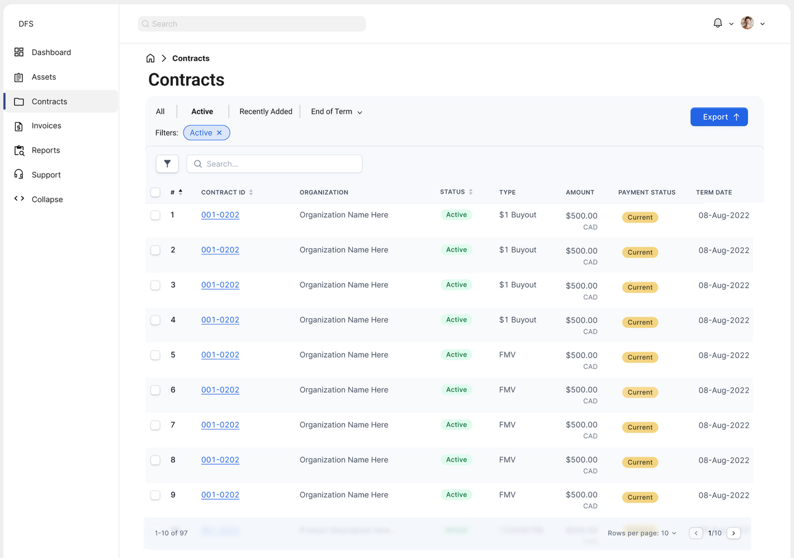
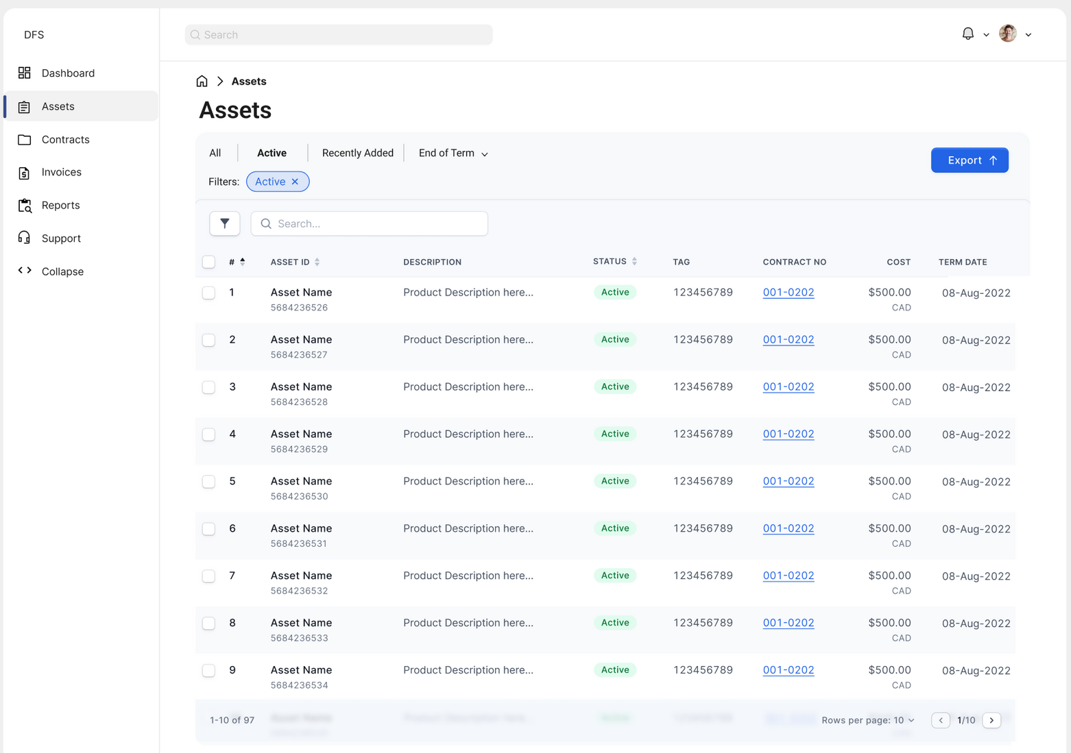
The assets and invoices views were rebuilt around clarity and speed. Consistent table patterns, smart filtering, and inline status indicators meant users could scan, find, and act without switching contexts.
Decisions that
moved the needle
| Decision | Rationale |
|---|---|
| Customizable dashboard | Different roles need different information front and center. A customizable layout respects that without requiring separate products. |
| Consistent table patterns | Assets, invoices, and contracts all use the same interaction model — reducing the learning curve across sections. |
| Inline status indicators | Color-coded status tags (Current, Past Due, Paid) let users triage without opening individual records. |
| Progressive disclosure | Summary views show what users need 80% of the time. Details are available on demand — not in the way. |
| AI/LLM-assisted self-service | Integrated intelligent search and recommendations reduced dependency on support teams for common queries. |
What guided
every decision
Clarity over completeness
Showing everything is the same as showing nothing. Every screen was edited ruthlessly to surface what matters and hide what doesn't.
Consistency builds confidence
Enterprise users work fast. Predictable patterns mean less cognitive load, fewer errors, and more trust in the system.
Design for the 80%
Most users do the same tasks most of the time. Optimize for the common case first, then make edge cases accessible without cluttering the main path.
Data should drive action
Visualizations aren't decoration — they're decision-making tools. Every chart and metric was tied to a specific action a user might take.